DOC GREEN’S
Doc Green’s is a gourmet salad & sandwich bar who we partnered with to refresh their brand as they expanded their store locations. Since 2010, we have focused on strategizing with them in their continued growth by maintaining a fresh brand image and ensuring their marketing efforts are up to date.
services
- Social Media Management
- Web Design & Development
- Content Marketing
- Branding
- Print Design
project scope
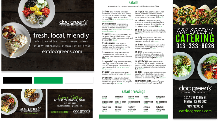
After working with Doc Green’s to bring their visual identity to life, we moved forward by carrying it through a variety of print materials, a social media campaign, and a new responsive website to increase digital engagement with customers, ultimately driving both in-store traffic and online orders. As their menu continues to evolve, we have worked with them in staying up to date on print materials for each of their stores.
web design & development
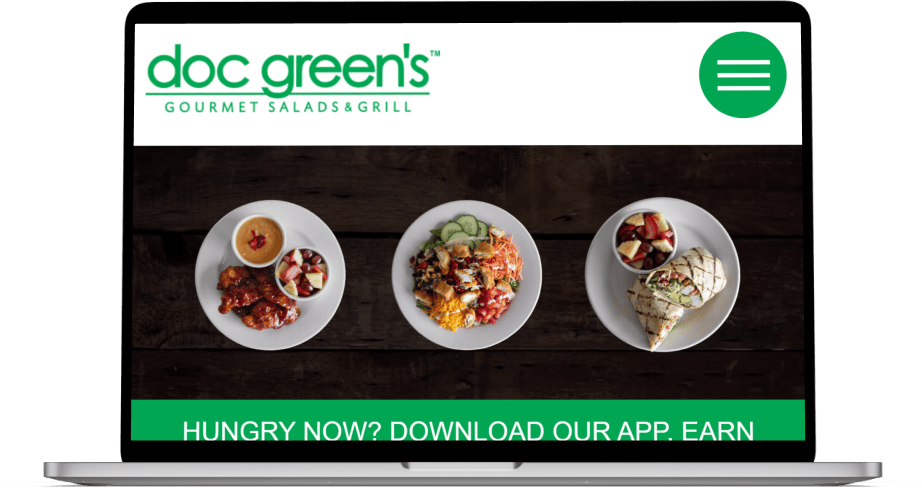
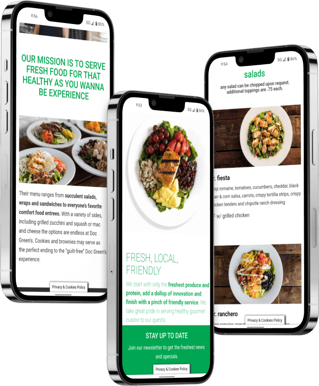
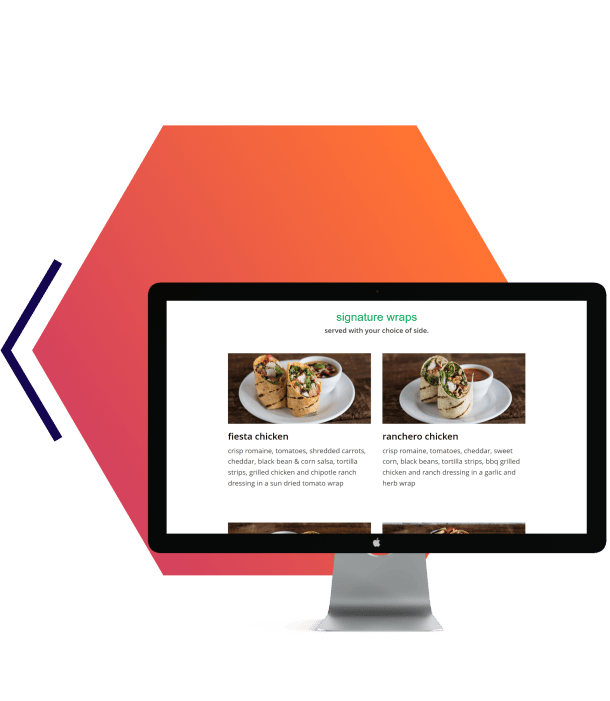
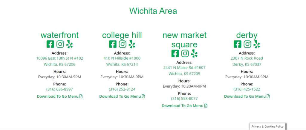
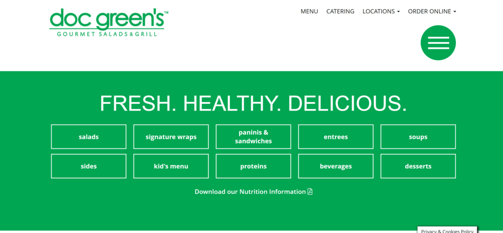
The focus for this website was to create an easily navigable system to ensure a delightful online experience for all potential users. As Doc Green’s grew, it was also important that users could find the closest location and view their perspective menu without any frustration. After establishing a solution for each of these features, we then prioritized maintaining a clean, fresh look and feel to match their original branding and really highlight the delicious food their menu has to offer.

social media management
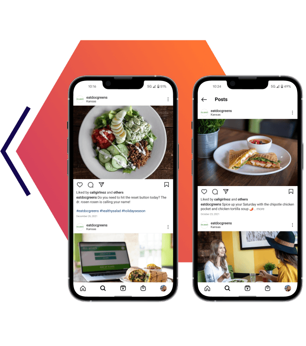
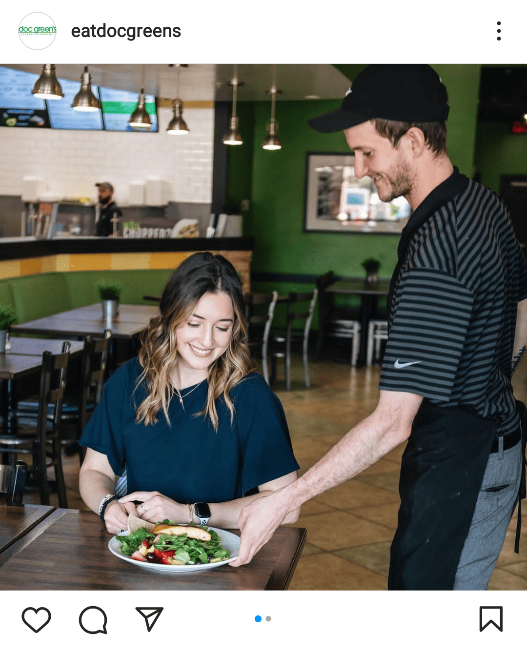
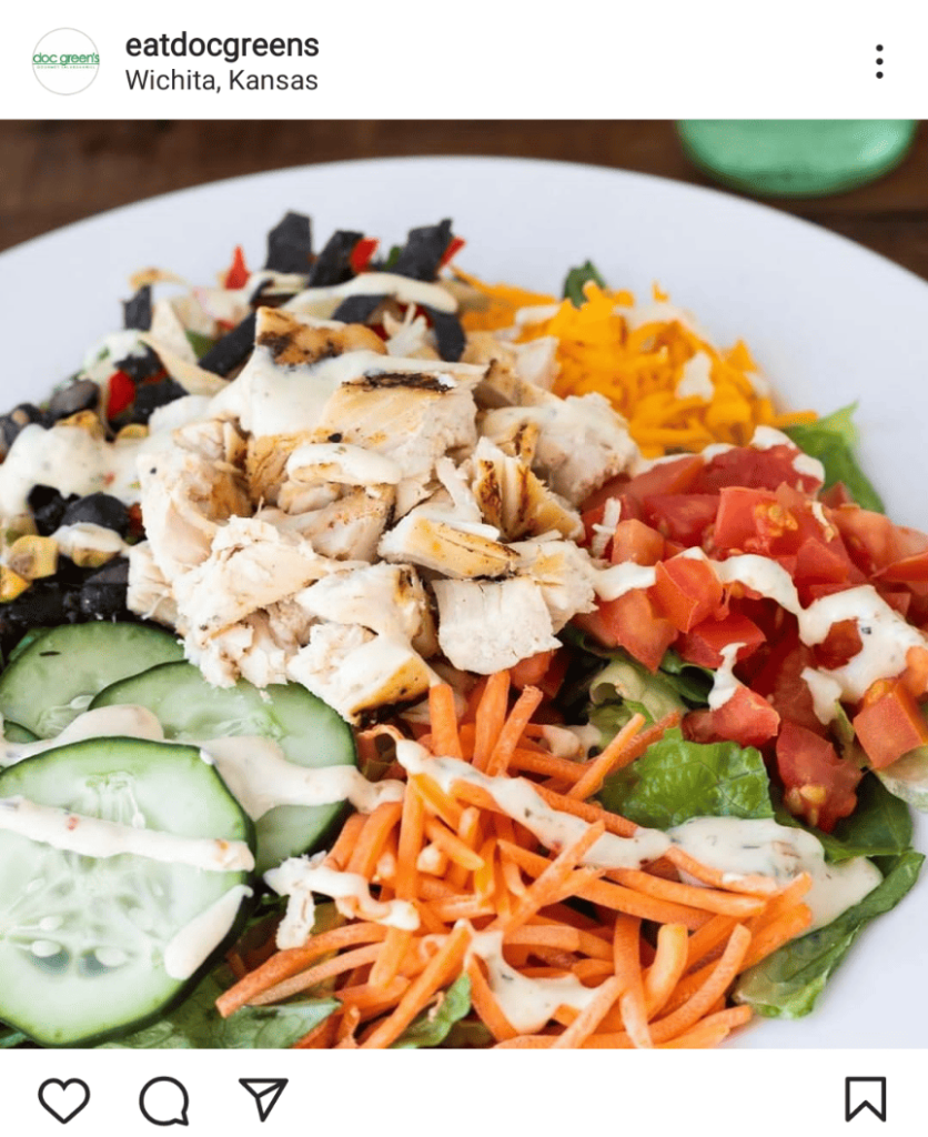
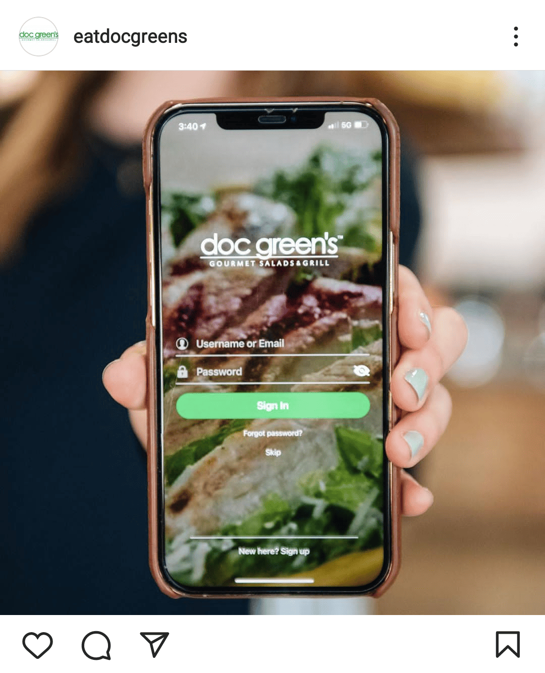
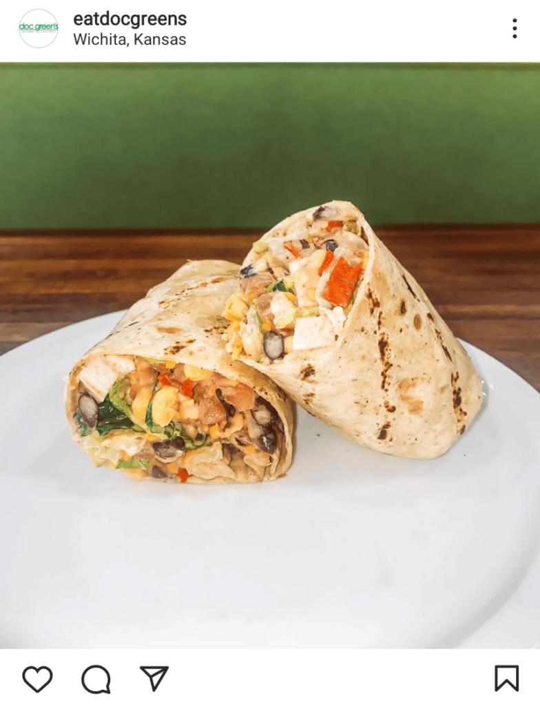
The key objective in our social media strategy with Doc Green’s was to showcase their extensive menu in a fun, interactive way, while also promoting their digital ordering opportunities. Along with relevant content, we paired high-quality photos of their food along with lifestyle images inside of the restaurant to give potential customers an idea of the entire Doc Green’s experience.
print design
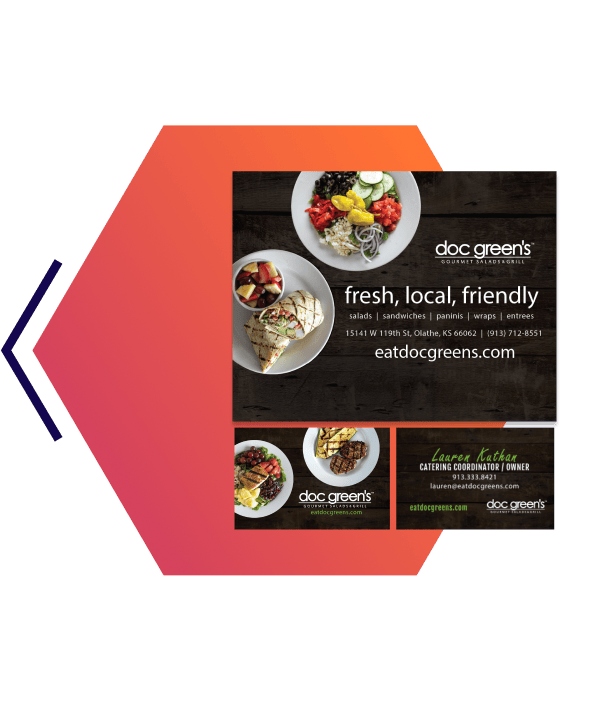
After consulting with Doc Green’s on branding, we worked with them to create a series of print materials for each of their store locations as their business grew. Each of the pieces in this campaign reflected their vision of a fresh and friendly experience, and included menu boards, business cards, menu brochures, banners, and posters.


